Comments
Redesigned the comments section for VC.RU


Context and Problem
vc.ru is a popular platform for entrepreneurs and IT specialists, where users actively discuss articles, news, and share opinions through comments. However, the comments section in the mobile app faced several issues:
Users experienced difficulties navigating and reading long comment threads on mobile devices due to a cluttered interface and insufficient visual hierarchy.
The lack of an intuitive reply system and inconvenient tools for rating and interacting with comments led to reduced engagement in discussions.
Inadequate adaptation for mobile screens: the layout of text and buttons made interacting with comments difficult, especially when reading long discussions.
Task: Redesign the comments section in the vc.ru mobile app, improving navigation, usability, and interaction with comments to increase engagement and simplify communication.
Role and Responsibilities
In this project, I served as a product designer. My main tasks included:
Conducting research on user issues when interacting with the comments section on mobile devices.
Developing an improved comments interface, focusing on easy navigation and enhanced user interaction.
Testing new solutions with real users and implementing changes based on feedback.
Work Process
Stage 1: Research
User behavior analysis: We began by analyzing current data and user feedback regarding the comments section in the mobile app. The main issues were:
Poor navigation: long comment threads were difficult to browse. Users often got lost in multi-level discussions.
Inconvenient reply interface: it was hard for users to track reply chains and return to previous discussion levels.
Limited interaction space: buttons for liking, replying, and other actions were too small and inconvenient to use on mobile devices.
User feedback: We gathered feedback from active users, who highlighted the following key problems:
They wanted clearer visual hierarchy for comments and replies to follow conversations more easily.
There were few convenient tools for interaction: it was hard to like, quickly reply to comments, or view discussion chains.
Stage 2: Designing the Solution
Based on our research, we identified several key directions for the redesign:
Visual hierarchy:
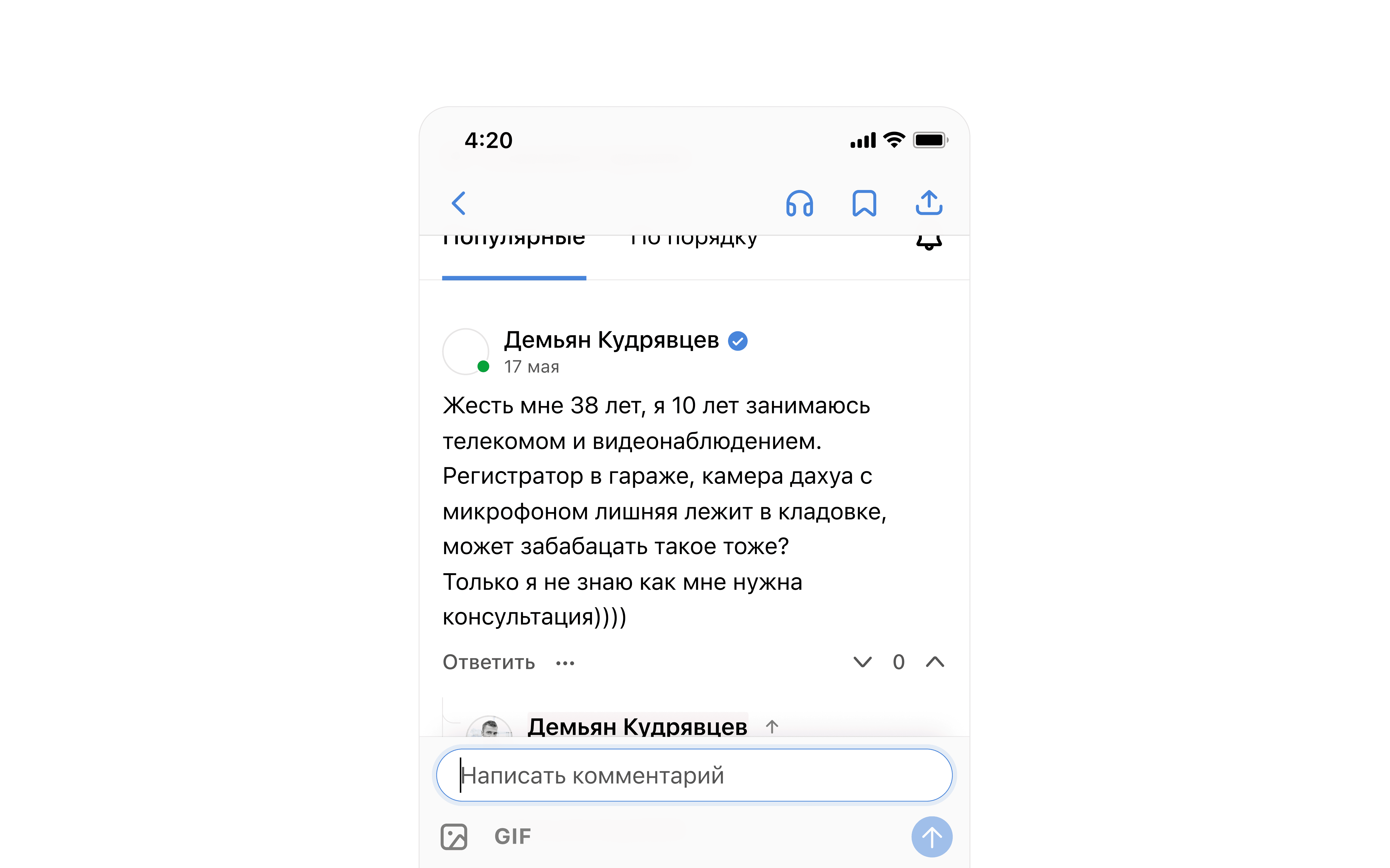
We improved the visual hierarchy of comments by adding indentation and color differentiation for different reply levels. This helped users navigate multi-level discussions more easily.
First-level comments were given more space for text, while replies within threads became more compact to make it easier to follow discussions.
Intuitive navigation:
A "collapse" and "expand" system was added, allowing users to hide or reveal long discussion chains without losing context.
A quick navigation feature was implemented, enabling users to jump back to the previous comment or the start of the thread, improving orientation.
Simplified interaction:
Click zones for like, reply, and other action buttons were enlarged, making them easier to use on mobile screens.
A "quick reply" feature was added, with a pop-up window for text input that didn’t cover the main discussion.
Integration with personal notifications:
To improve user engagement, a feature was added that displayed notifications of new replies directly within the comments section, simplifying navigation to new messages.
Stage 3: Prototyping and Testing
After developing the concept, we created several interactive prototypes of the new comments interface:
The prototypes were adapted for different screen sizes to account for the features of various mobile devices.
We tested the prototypes with a group of users who actively commented on vc.ru.
Testing Results:
Users noted that the new indentation system and collapsible comments significantly improved the experience of reading long discussions.
Simplified interaction buttons (likes, replies) received positive feedback, especially on smaller screens.
The quick navigation between comments and the ability to collapse threads helped users save time when reading and participating in discussions.
Stage 4: Implementation and Support
After gathering feedback and refining the prototypes, we handed the layouts to the development team for implementation. During the integration process, we continued to collaborate closely with the developers to ensure the proper implementation of all design details. We also conducted regular tests to check the design’s adaptability across all devices.
Results
After the redesign of the comments section in the vc.ru mobile app, the following results were achieved:
20% increase in user activity: Thanks to improved navigation and a more user-friendly interface, users started leaving more comments and replies.
Reduction in interaction time with comment threads: Users were able to find necessary comments and manage multi-level discussion threads more quickly.
Growth in the number of likes and replies: Due to larger click zones and more convenient interaction buttons, the number of likes and quick replies increased by 15%.
Positive feedback: Over 80% of users who participated in surveys after the redesign noted improved usability of the comments section on mobile devices.
Conclusions and Reflection
The redesign of the comments section demonstrated the importance of improving navigation and interaction convenience for mobile users. Segmenting multi-level discussions, an intuitive system for collapsing threads, and convenient control elements led to a significant increase in activity and enhanced user experience. In the future, additional features such as extended notifications and user activity analytics could be considered to further personalize their interaction with content.